Cory Community Advisor Administrata Plus Oct 4, 2024 #11 Amazing job to everyone involved, the logos look very nice! I still think the subtext is tiny, but I can live with it.
Amazing job to everyone involved, the logos look very nice! I still think the subtext is tiny, but I can live with it.
Cedric ready to reach your impossible? Administrator Oct 4, 2024 #12 Cory said: Amazing job to everyone involved, the logos look very nice! I still think the subtext is tiny, but I can live with it. Click to expand... Great, now I'm in doubt again.
Cory said: Amazing job to everyone involved, the logos look very nice! I still think the subtext is tiny, but I can live with it. Click to expand... Great, now I'm in doubt again.
capnsquarepants Community Explorer Oct 4, 2024 Thread Author #13 Cedric said: Great, now I'm in doubt again. Click to expand... I'm on a 4k monitor and I can see well enough haha
Cedric said: Great, now I'm in doubt again. Click to expand... I'm on a 4k monitor and I can see well enough haha
Cedric ready to reach your impossible? Administrator Oct 4, 2024 #14 capnsquarepants said: I'm on a 4k monitor and I can see well enough haha Click to expand... So you’ll supply everyone here on a 4k monitor? Great, thanks buddy.
capnsquarepants said: I'm on a 4k monitor and I can see well enough haha Click to expand... So you’ll supply everyone here on a 4k monitor? Great, thanks buddy.
frm Community Enthusiast Oct 4, 2024 #15 Cedric said: I'm going to stop now. Click to expand... No. Keep going. Make a font specifically with the logo so you can use it in text. Reminds me of when I did it for Parler. Unmaintained - Parler Share Button (Template Mod) The downloadable zip file must be uploaded as Parler is not apart of Font Awesome and likely won't be due to their $3000 branding fee (or be denied completely if they share the same values as Big Tech, etc.), until there is more adoption of this... xenforo.com
Cedric said: I'm going to stop now. Click to expand... No. Keep going. Make a font specifically with the logo so you can use it in text. Reminds me of when I did it for Parler. Unmaintained - Parler Share Button (Template Mod) The downloadable zip file must be uploaded as Parler is not apart of Font Awesome and likely won't be due to their $3000 branding fee (or be denied completely if they share the same values as Big Tech, etc.), until there is more adoption of this... xenforo.com
Cory Community Advisor Administrata Plus Oct 4, 2024 #16 Cedric said: Great, now I'm in doubt again. Click to expand... Does the text scale with resolution? If so, that might be why it's so tiny for me. My screen resolution is only 1366x768.
Cedric said: Great, now I'm in doubt again. Click to expand... Does the text scale with resolution? If so, that might be why it's so tiny for me. My screen resolution is only 1366x768.
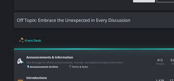
capnsquarepants Community Explorer Oct 4, 2024 Thread Author #17 Cedric said: So you’ll supply everyone here on a 4k monitor? Great, thanks buddy. Click to expand... If only I was Elon levels of rich lmao This is how it looks like on my phone. It does look a little small on here. View attachment 100
Cedric said: So you’ll supply everyone here on a 4k monitor? Great, thanks buddy. Click to expand... If only I was Elon levels of rich lmao This is how it looks like on my phone. It does look a little small on here. View attachment 100
Cory Community Advisor Administrata Plus Oct 4, 2024 #18 I see it appears much easier to read on dark mode than light mode.
Cedric ready to reach your impossible? Administrator Oct 6, 2024 #19 Is everyone now satisfied with the logo before I archive this?
Cory Community Advisor Administrata Plus Oct 6, 2024 #20 I don't know what change you made, but the text doesn't seem as tiny and easier to read on light mode now.
I don't know what change you made, but the text doesn't seem as tiny and easier to read on light mode now.

")


")